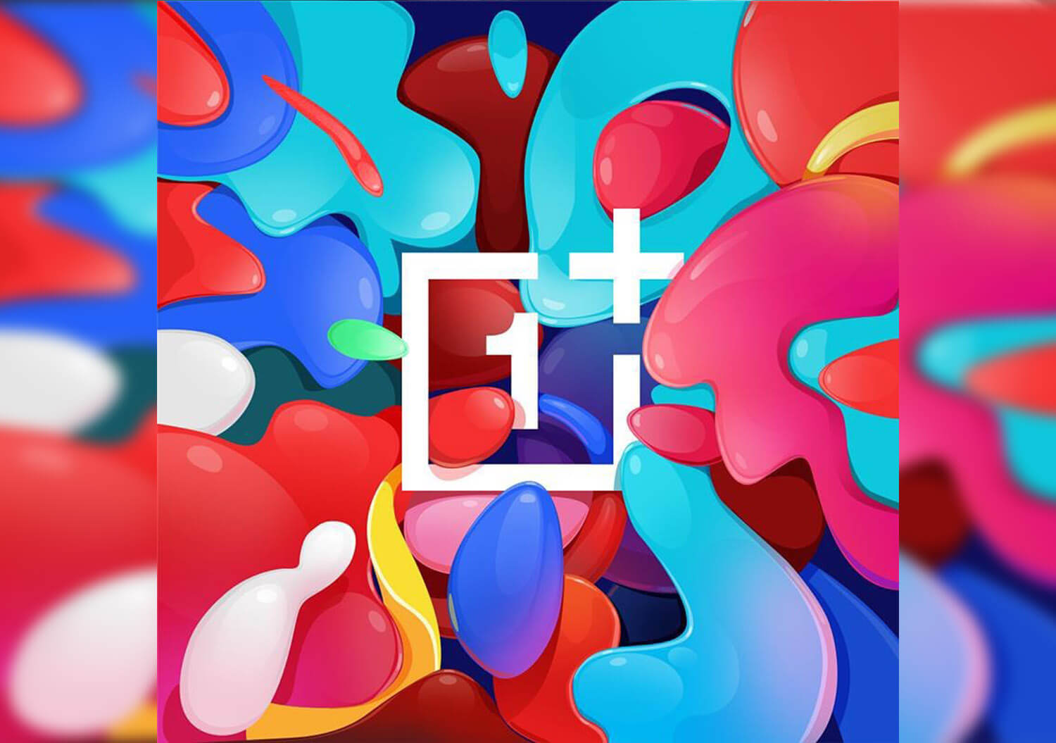
OnePlus has unveiled its new logo and well, it is more colourful yet defined!
From the previous design, the company has made a few changes to make the logo stand out. The biggest change is seen in the brand’s ‘1’ symbol which was previously an ‘i’. As for the visual identity, the new OnePlus logo gives a more balanced feel.
The logo introduces a curvilinear design for ‘1’, easier to read while the plus sign has also been enlarged and is made more prominent now. A recognition to the OnePlus community, the logo has played a key role in the company’s ongoing success. It creates a better association between the symbol and the trademark, while also improving the recognition ability in digital media.
Also, the logo’s visual identity is appreciated by the users. It is accompanied by a fresh colour palette which centers on OnePlus’s iconic red. This is followed by an updated secondary palette of cyan, green, magenta, indigo and yellow to make the design more vibrant and lively.
From moving to a new font to updating OnePlus logo’s colour palette we love the refreshed and vivid change!


