ONCE UPON A TIME THERE WAS AND THERE IS STILL A TAVERN
This story begins with “Once upon a time there was…a tavern”.
The tavern was a meeting point for villagers and a place where travellers could rest. At the tavern, you were never alone since, after all, it is more enjoyable to drink a glass of wine in company than by yourself. The tavern is a place that recalls ancient times and habits. But now it rises again with a renovated look through a restyling project realized by architect Emanuele Svetti of Studio Svetti Architecture.
The new dining place’s name is Osteria Moderna. It opened at the exit of the motorway of Arezzo the 8th of April 2021. It is a real jewel in the heart of Tuscany and the home city of great poets and scholars such as Vasari, Petrarca, Guido d’Arezzo and Piero della Francesca to mention a few. Designed 5 years ago by Studio Svetti Architecture, the design concept is now a sign of hope: “The ideas come out from the darkness to see the light” as the architect said. This place is designed as a modern tavern intended for those who travel since it is easy to reach. It could also become a reference point for a local clientele. It is indeed designed as a place of memory but it shows also a contemporary taste. “I like designing places that last over time – continued architect Emanuele Svetti – this is the key to success for my design projects in a world where people seek for a successful formula. I like designing places which combines a refined concept and functionality”.
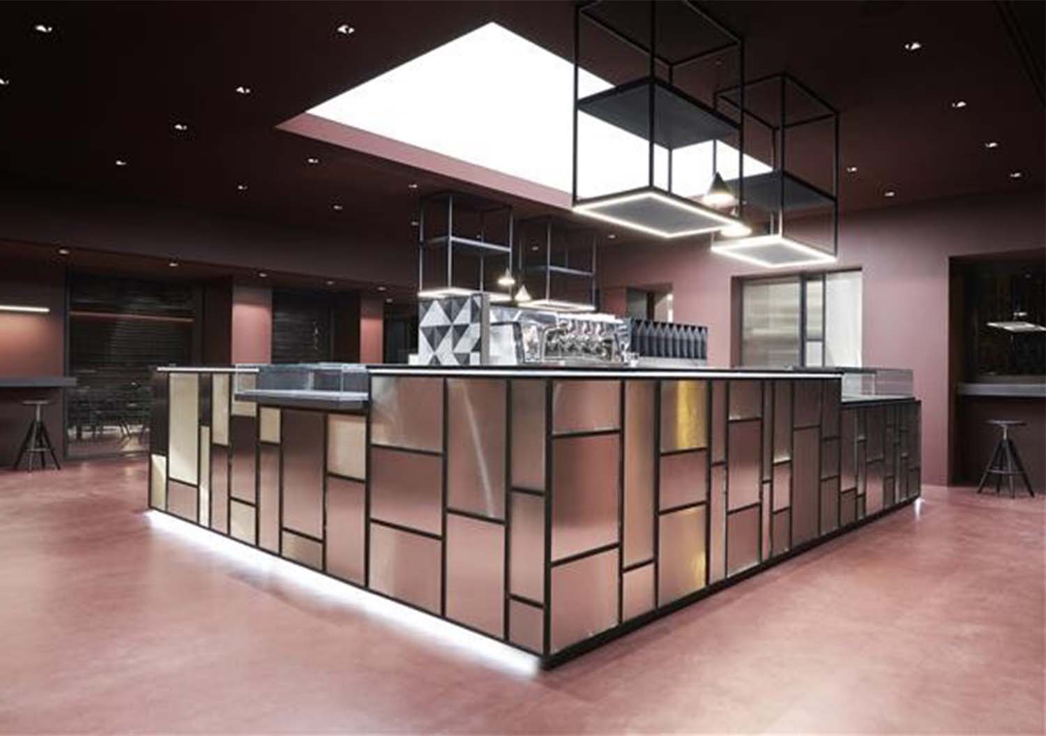
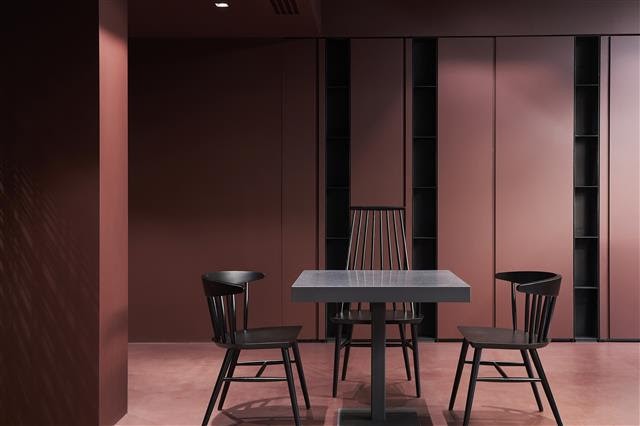
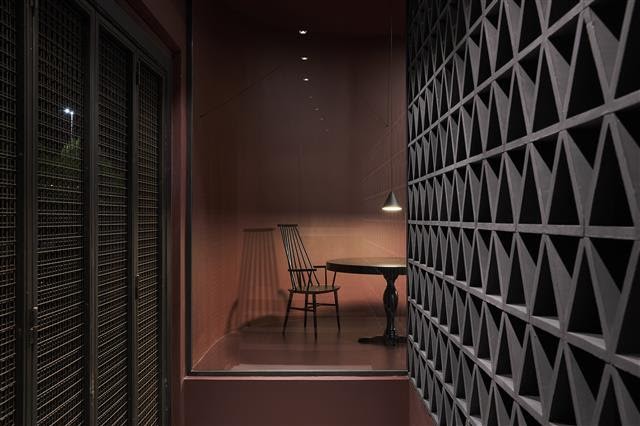
In the Osteria Moderna project, the starting point was amaranth color tone in its warmest and more captivating shade like a beating heart entering the interiors of the tavern fully painted with this color. “a touch of color works better than a bucket of cold water, as Matisse said –explained the architect – red color is appealing and, in some way, ‘attacks’. It’s the best color for an effective visual communication. It’s the color of energy, but also the color of wine in a city where wine is greatly appreciated.”
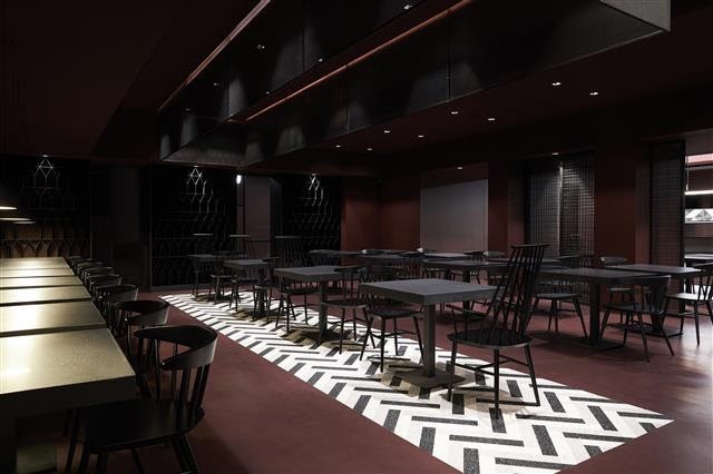
“Sometimes, it is really great to enjoy delicious scents, strong flavors and typical colors” and this is the concept designed for the coverings and floorings. The floor is a continuous surface made with epoxy resin with inserts realized in grit tiles for a Terrazzo alla Veneziana effect to create an unconventional mix of colors and materials. At the center of the restaurant area there is a drawing of cement tiles in three shades of grey which creates an unexpected chromatic variety, but also a point of attraction in the environment because of the sharp contrast choice made by the studio.
Color had a double function of creating a more harmonious environment and, at the same time, of adjusting light on the time of the day to create an extremely relaxing half-light. On the contrary, the café area is very bright: Natural light enters from the windows located along the sides of the building, whereas, during the night, it is replaced by soft artificial light streams which create an intimate and confidential atmosphere. This contrast between day and night with a play of lights and shadow specifically designed is part of the charm of the place. It is a sort of reinterpretation of the Tuscany spirit which can be seen also in the gastronomic offer that traditional Tuscany dishes with proposals from other cuisines.


