When we were approached to design the interiors for the new Physique 57 India studio at Kemp’s Corner, I was definitely nervous. The previous space (their flagship studio at the Four Seasons Hotel in Mumbai) was big, beautiful and designed by none other than Neterwala & Aibara, so I had big shoes to fill.
The new space under question, was smaller, darker, and more complicated, as it is housed within a structure that was built in the early 1900’s. The walls were mostly load bearing, proving it difficult for us to break or puncture any, hence planning and circulation was severely restricted. Due to the age of the property, adding structural load was also restricted by the various advisers, and a large part of the space didn’t even have a proper slab flooring, so we had to build it out with steel! There was also only one designated area which could be used for bathrooms and plumbing, hence we kept all those utilities separate in that area, which is now the ladies locker room, the bathrooms and the pantry.
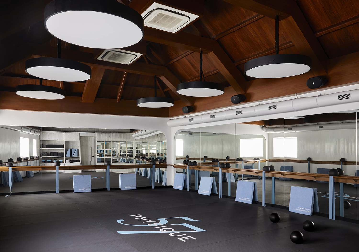
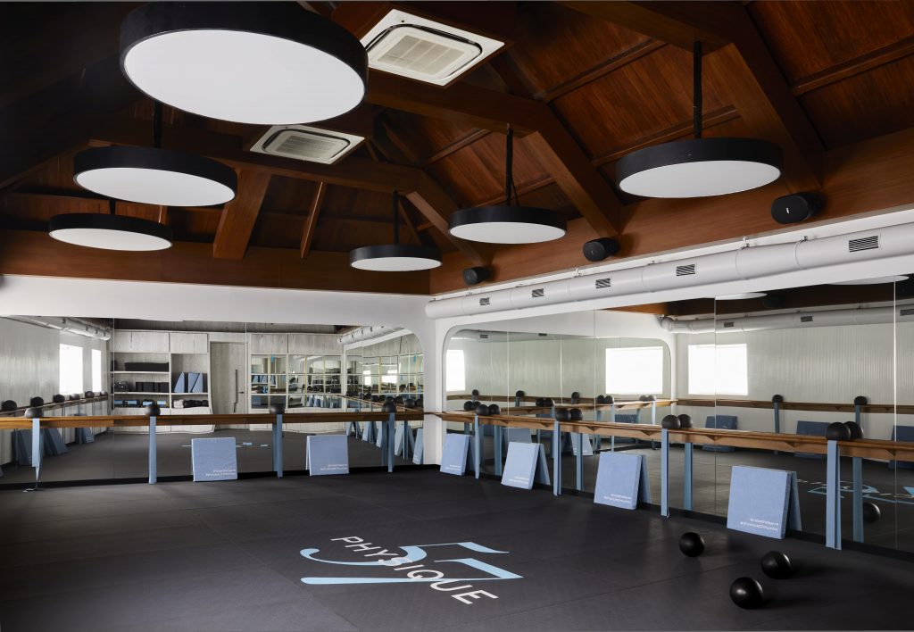
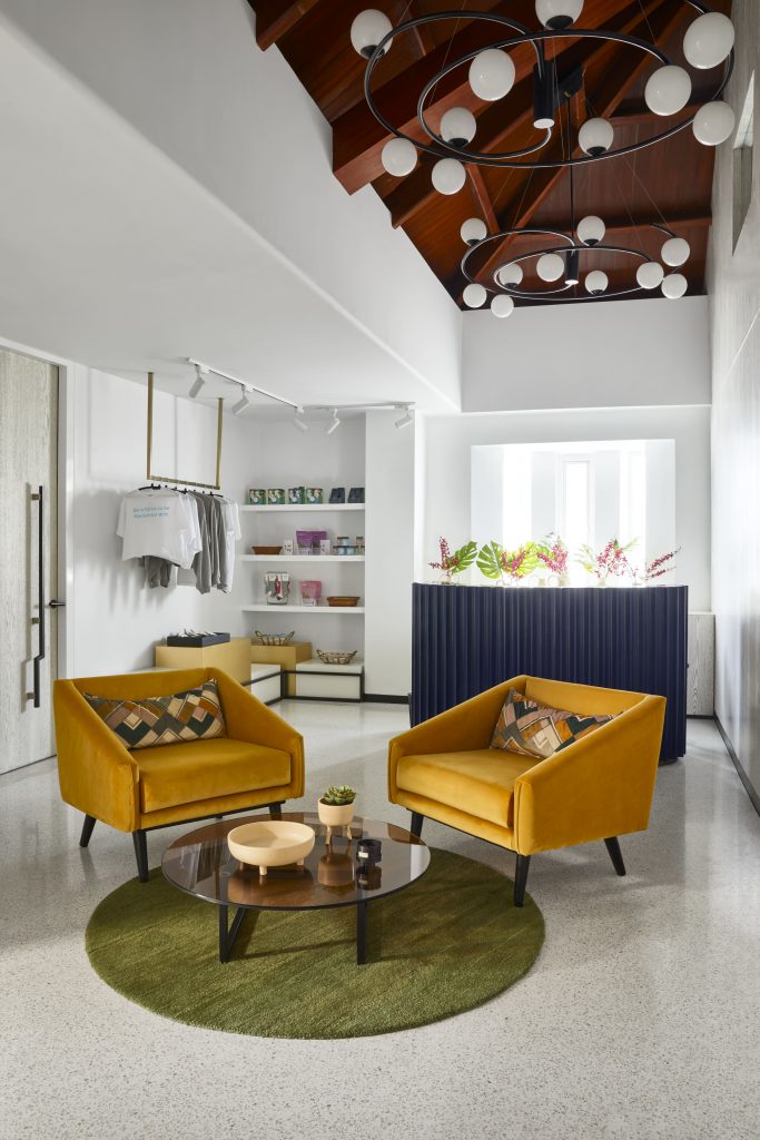
While we had many restrictions, we also had a wonderful heritage property with the beautiful double height wooden ceiling that serves as the roof of workout Studio 1. This was a key feature around which the design evolved, as it was extremely important to retain this wonderful inheritance.
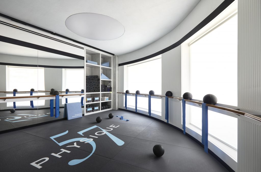
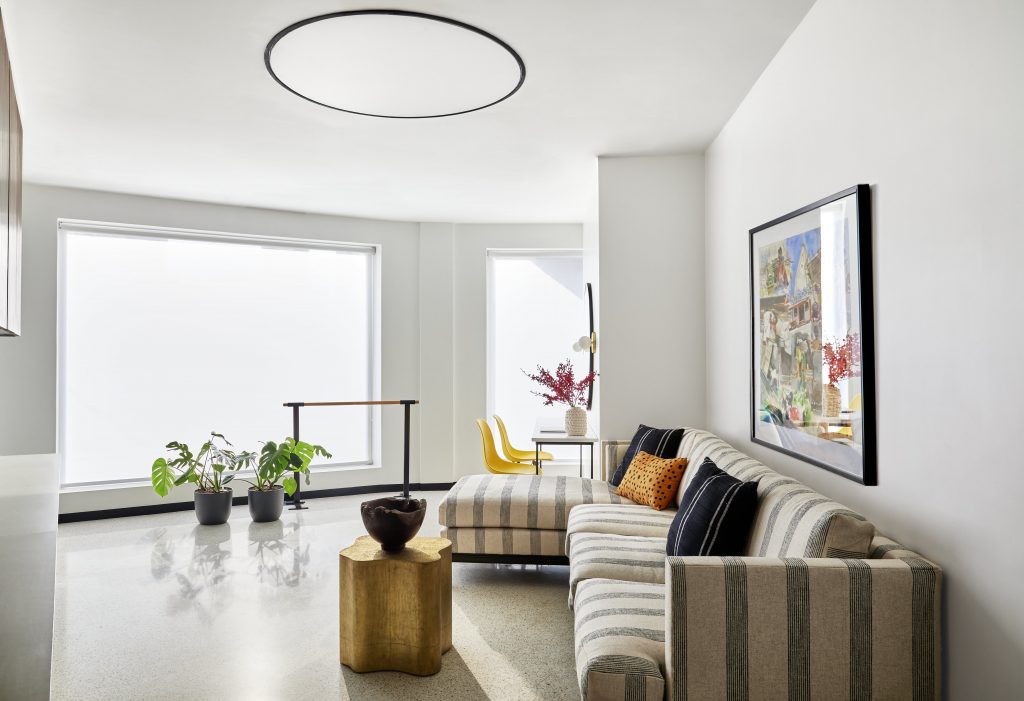
Mallika Parekh, the owner of the Physique 57 India brand, was insistent that the space look fresh, bright and happy, with an abundance of natural and bright light, while also being an accurate representation of Physique 57, which is a global brand. This new space didn’t have too much natural light save for the Office and workout Studio 2. We compensated by adding large drums and fake skylights to give a large general wash of light from the ceilings. We avoided spot lights which tend to throw shadows, and used a lot of white, or tones of white, mirrors and kept the walls light in order to amplify the feeling of space and make it feel breezy.
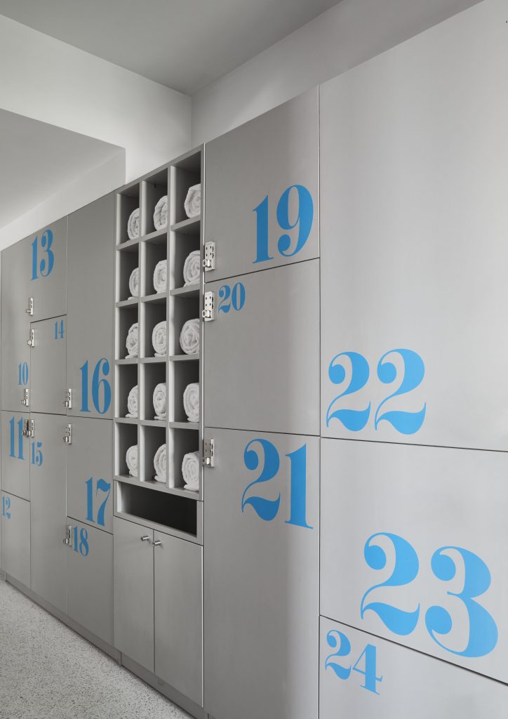
A lot of the furniture and loose accessories were re-used from the previous studio, which helped connect the two spaces in the eyes of the clients and provide some aesthetic continuity. The boutique, bathroom counters, sanitary fittings, furniture, office desks, lockers and door handles were all re-used.
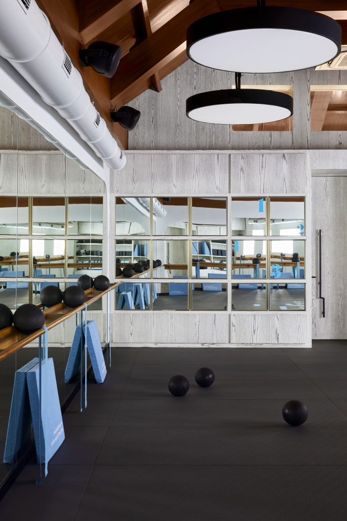
We chose a beautiful, oak-grain, white veneer that now forms a large part of the canvas for the space. It was selected bearing in mind the design brief – keeping the space light and bright, while giving it a unique character and identity. This beautiful oak grain veneer therefore worked beautifully for us across the space on the partitions and doors between the studios and the reception, in the locker rooms and inside the Studios, as it gives the warmth of wood, accents the existing teak roof and enhances the space wonderfully without looking over bearing. Even the white terrazzo floors and white painted walls all work towards the same purpose.
 Physique 57 brand accents were brought in through the signage and lettering, the decals on the manifesto wall that greets customers as they enter, and pops of colour that make the space look young, lively and dynamic – just like a fitness studio should. Wherever we chose new furniture, we did so keeping the same brief in mind, which resulted in the interesting silhouettes of the reception area furniture and desk, in hues of mustard, blush, and navy blue.
Technical aspects like sound, lighting, fresh air purification and ventilation, sound proofing and of course maintaining the existing structure were all very carefully considered and designed to make the space function as it does today. Physique 57 has also invested in a TFA fresh air system in both studios, that filters air for particulate matter up to 99.5%; and has also installed ionizers in all common areas, that are approved for Covid safety.
Physique 57 India
Studio designed by Shonali Mahajan, Studio Wodehouse
www.physique57india.com
https://www.instagram.com/physique57india/
https://www.instagram.com/studiowodehouse/


