
Corporate, Unbuttoned Nariman Point’s old-school business address gets a young, tactile rewrite, open, airy, and quietly radical, designed by Polka House. Nariman Reset In the heart of Nariman Point, a district defined by the rigid corporate legacy of Mumbai’s financial history, this 2,500 sq ft office offers a quieter, more fluid alternative. It is a …
Corporate, Unbuttoned
Nariman Point’s old-school business address gets a young, tactile rewrite, open, airy, and quietly radical, designed by Polka House.
Nariman Reset
In the heart of Nariman Point, a district defined by the rigid corporate legacy of Mumbai’s financial history, this 2,500 sq ft office offers a quieter, more fluid alternative. It is a space that privileges ease over formality and tactile earthiness over corporate polish. The site’s greatest asset was its view. Expansive vistas of the Arabian Sea, the Oberoi Hotel, and Mumbai’s skyline become the project’s defining anchor.
Completed within a tightly compressed timeline of just eight weeks, the office is as much about efficiency as it is about clarity of intent. Stripped back to its bare shell and rebuilt with precision, the process reflects a young, dynamic approach, decisive, adaptable, and free of excess.
The brief, shaped through close dialogue with the client, called for a space that felt grounded and relaxed, earthy without feeling dated, tactile without being overworked. The ambition was simple yet demanding: to create an office that doesn’t immediately feel like one, but instead feels welcoming.
This transparency is not merely visual but spatial. The planning adopts an open, connected framework where cabins remain visible, and thresholds are softened. Upon entering through the foyer, one reaches a centrally placed waiting area that doubles as an informal lounge. At the heart of the office, an antique stone goddess statue serves as both a sculpture and a mandir, aligning the office with Vastu principles.
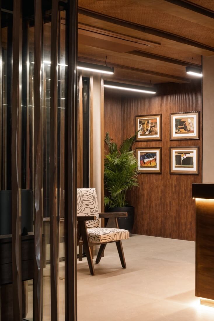
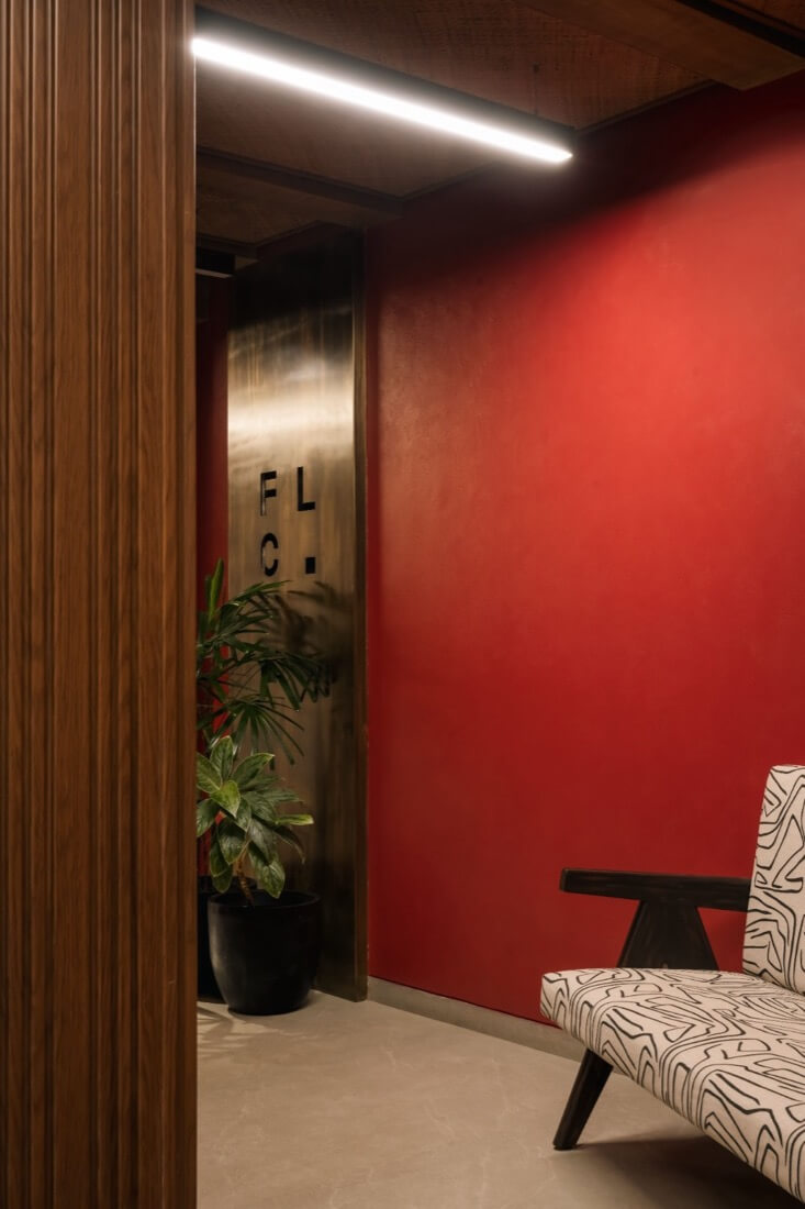
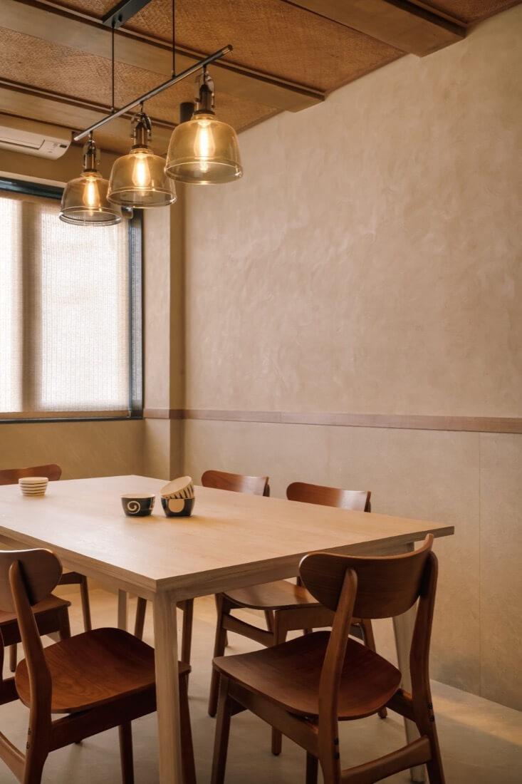
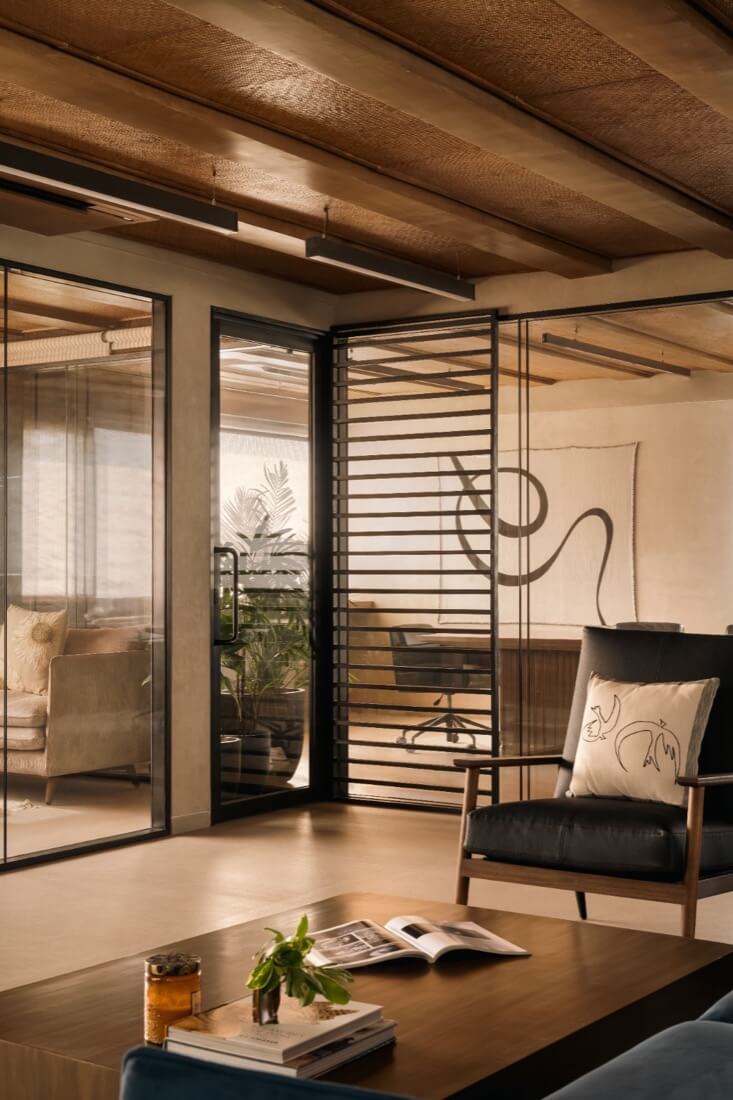
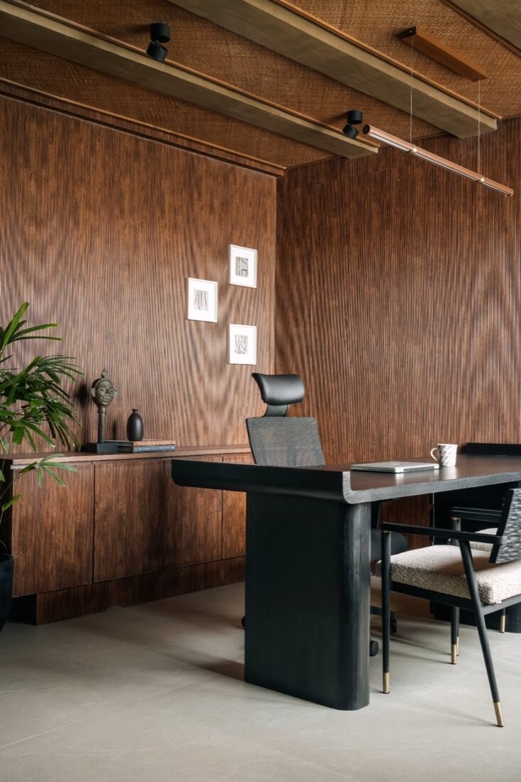
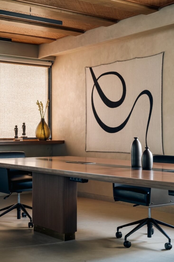
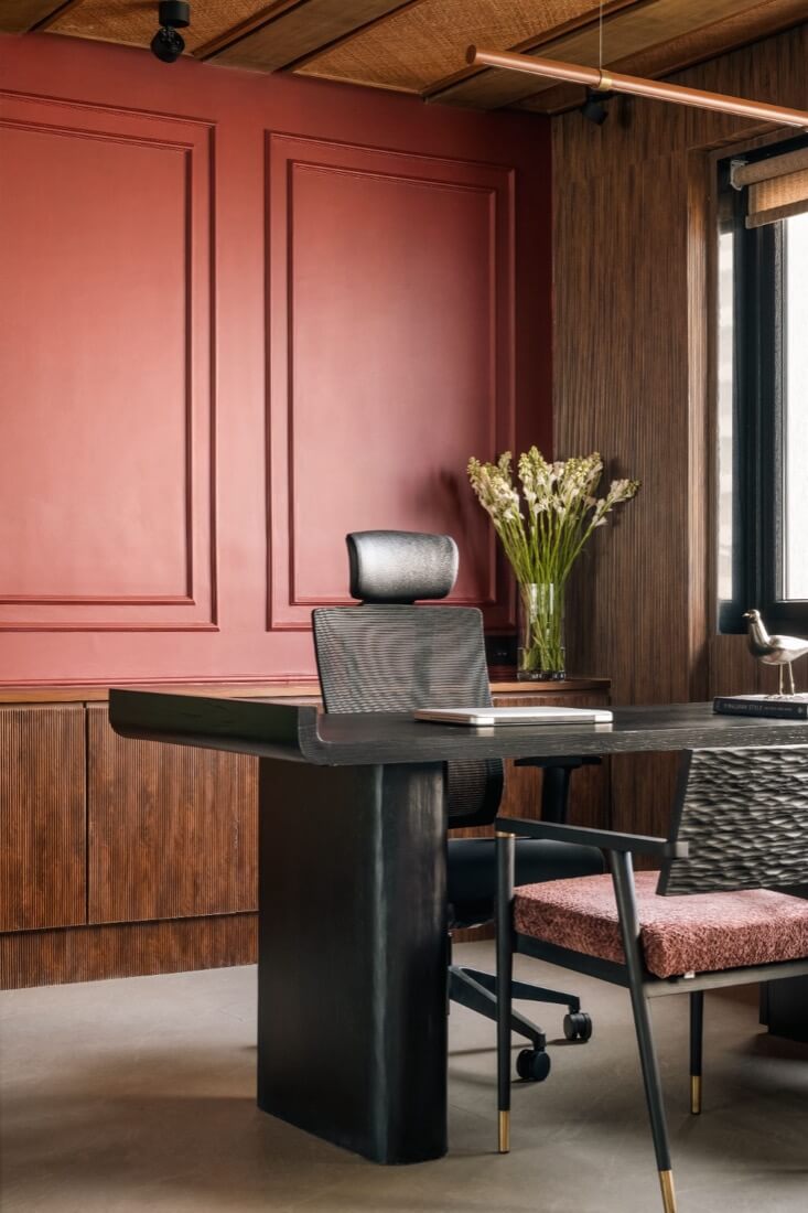
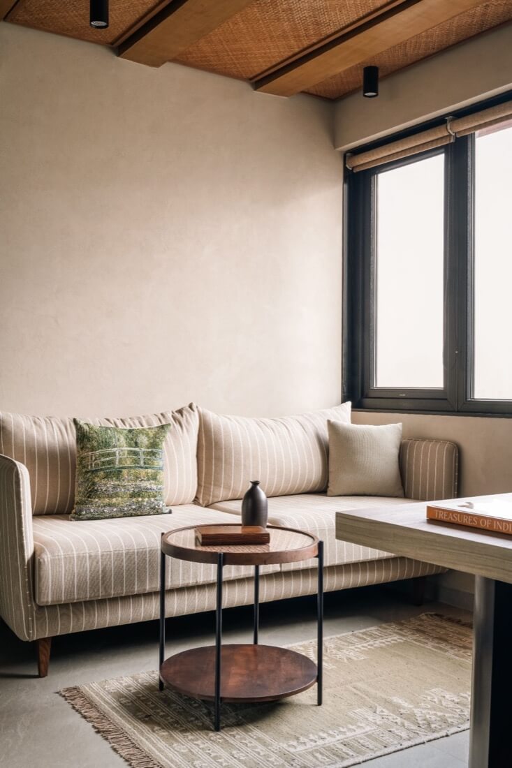
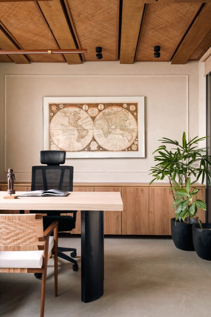
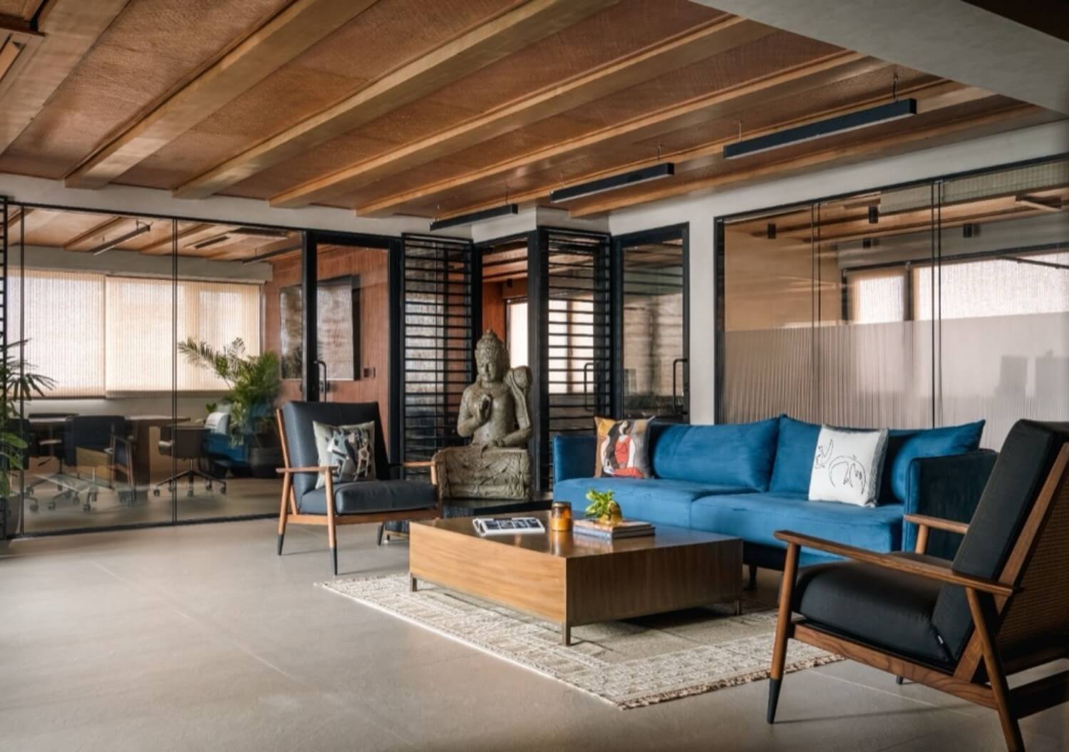
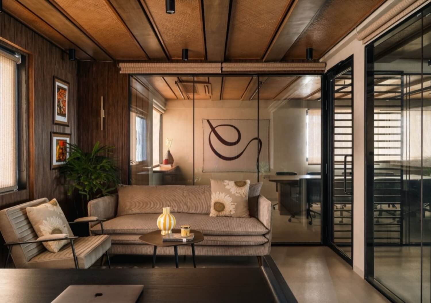
Materiality became a function of time. By selecting wood-plastic composites, cane, and brass, the design team bridged the gap between rapid execution and sensory richness. These weren’t just pragmatic choices; they were the building blocks of an environment that feels grounded, not rushed..Dark wood tones and earthy hues dominate, punctuated by moments of black that lend depth and definition.
The ceiling, often a constraint in older buildings, is treated with particular care. Instead of lowering it further, cane inserts are introduced between existing beams, adding texture without sacrificing height. Along the walls, angled wooden slats filter light into the space, casting soft, shifting patterns that animate the interiors through the day.
Greenery is woven in deliberately, softening edges and reinforcing the office’s informal character. The palette remains grounded, browns, warm neutrals, and deep reds forming the base, with cooler tones appearing subtly through plants and art.
Vaastu principles quietly inform several key decisions within the plan. The entrance is thoughtfully repositioned, announced by a bold red door that introduces a deliberate moment of contrast within an otherwise muted palette. Cabin placements follow a clear directional logic, aligning function with spatial orientation. Rooted in tradition yet expressed with restraint, these interventions are seamlessly absorbed into the office’s contemporary language, felt more than overtly seen.
Furniture and detailing are approached as precise design interventions, reinforcing efficiency without compromising intent. Several elements are fabricated on site, such as desks, tables, and select seating pieces, allowing for agility in execution while retaining control over proportion and finish. Where required, ready-made components are carefully integrated to maintain visual continuity and coherence across the space. Office chairs by Featherlite and guest seating by Josmo are selected to align closely with the project’s design language.
Lighting, too, is treated with restraint. Abundant daylight reduces reliance on artificial illumination through the day, while a layer of warm ambient lighting takes over in the evenings, sustaining a consistent sense of comfort. Blinds act as subtle mediators, tempering the intensity of the sun and allowing the interiors to transition gently over time.
By leaning into the constraints of an ageing structure and a compressed calendar, the project proves that speed and substance are not mutually exclusive. It moves away from the sterile rigidity of its neighbors, proposing instead a workplace that is fluid, human-scaled, and unpretentiously raw.
Constraints, whether of time, structure, or access, are not merely resolved but leveraged. Limited ceiling heights, the challenges of retrofitting an older building, and the need for rapid delivery sharpen the design’s clarity. Glass replaces heavier construction, modular materials stand in for bespoke processes, and a streamlined execution strategy ensures coherence throughout.
The office moves away from the rigidity and formality that often define its context, proposing instead a setting that is fluid, tactile, and human in scale. Ease becomes a design tool, interaction a spatial strategy, and rawness an underlying sensibility. Efficacy is treated as a catalyst, driving a process that is both swift and considered. The result is a space where design thinking remains uncompromised, even under pressure, asserting that speed and substance need not be mutually exclusive.